Saturday, October 30, 2010
Lakehouse Love
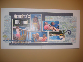
I used another great PageMaps sketch for this layout, along with Apron String's 5-on-Friday. It felt awkward to use patterned paper instead of my typical cardstock base... but now that I see the final result, I guess going back to your roots once in a while can be like welcoming an old friend.
Santa's Little Helper
Apple Delight
Tuesday, October 26, 2010
Fun on the Farm
For the Croptoberfest Day 10 challenge at http://www.apronstringsdesigns.blogspot.com/, to try a new technique, I decided to make a custom 3-dimensional embellishment using wet cardstock. For the husks of the cornstalk, I cut leaf shapes out of white-core cardstock and soaked themm in water. I wrinkled them and squeezed the excess water out and then molded them into shape to dry. The white core helped to enhance the edges, as they begin to peel away into layers. The corn cob inside the husks I made by stamping the eraser-end of a pencil in chalk ink and stamping individual ears of corn. I think it turned out pretty cute!
Celebrating 4th of july
Saturday, October 23, 2010
cool summer fun
Friday, October 22, 2010
American Girls
I did this layout for the Croptoberfest Day 9 challenge @ http://www.apronstringsdesigns.blogspot.com/, which was a "5-on-Friday" using only:
-kraft or brown cardstock
-1 sheet patterned paper with either gold, burgundy or orange
-1 length ribbon
-1 handful of brads and buttons
-1 sheet of cardstock stickers
Thursday, October 21, 2010
Silly Bandz
Fright Fest
Saturday, October 16, 2010
Apple Pie
our little MVP
Friday, October 15, 2010
camp
For Croptoberfest's 5 on Friday challenge at Apron Strings, to use:
-1 sheet of orange or green cardstock (I used another sheet to make it a 2-pager)
-1 sheet of pattern paper with stripes or plaid on one side
(the red is the opposite side)
-1 set of felt or fabric embellishments
-1 set of naked chipboard
-1 set of something round
Hello Second Grade
Goggles
For the Croptoberfest Monday 10/11 challenge at Apron Strings, to find a "hard to be thrilled by" old layout and be inspired by it. I did the ice cream layout a while back, when I wanted to use a large shaped patterned paper as a background on a page. It was awkward to turn into 2 pages though and it felt off-balance to me, and not really tied together as a double page layout. So for the Goggles layout, I used a shaped patterned paper background again, but with more of a running bond to tie the 2 pages together.
Friday, August 13, 2010
Gym Play
Wednesday, July 21, 2010
On the Move
For My Croppy Summer challenge #13 @ http://www.apronstringsdesigns.blogspot.com/, to "crumple, tear, antique or otherwise distress something on your layout." I distressed the patterned papers, tags and round date letters/numbers & inked the solid papers. I also added white-out on the edge of the photos and sanded it to give them an aged feel. They match the rub-on title well.
This is OFFICIALLY THE LAST layout I had to do to complete my daughter's first album (2003, the year she was born). I'm feeling a HUGE sense of accomplishment tonight!!!!!!!
You are my Sunshine
For My Croppy Summer challenge #14 @ http://www.apronstringsdesigns.blogspot.com/, which was a layout based on a sketch by Gloria Stengel, that I rotated 90 dgerees. I had stitched the flower in this paper long ago, with no purpose in mind. It must have been a creative day and I needed an outlet. I'm very happy to finally find it a good home. :)
Tuesday, July 20, 2010
First Christmas
Friday, July 16, 2010
So Loved
Happy Baby
Sunday, July 11, 2010
Right at Home
I did this layout for the August Guest Designer Team Member challenge @ http://sketchythursdays.blogspot.com/. In addition to the sketch, I had to use yellow and incorporate a handmade accent (the hanging birdhouse).
Saturday, July 10, 2010
Sweet Girl
For My Croppy Summer Challenge # 7 @ http://apronstringsdesigns.blogspot.com/, to be inspired by an old layout. I looked though my first 2 albums and found the below page, which mortifies me!
-First, I don't know why I thought that ANYTHING pink was appropriate to be combined together. There's probablly 15 different shades of pink (and only pink) that don't belong together on there. So on my new layout, I wantd to use pink in a more controlled way, and incorporate other colors.
-I don't like that I used full sheets of patterned paper as a background, so for the new layout I still incororated patterned paper as a base, but balanced it with cardstock and an inner piece of a more neutral pattern.
-I don't like the placement of photos below, so for the new layout I organized them so that several small photos grouped together balanced out 1 larger photo on the right.
-I also incorporated some differnt techniques on the new layout, such as an acrylic-paint stamped title and Glimmer Mist on the cardstock.
Seaside Heights
For My Croppy Summer Challenge # 5 @ http://apronstringsdesigns.blogspot.com/ , to use paper only. I tend to avoid scrapping big holidays and vacations, just for the shear volume of photographs and how many pages they could turn into. I took advantage of the paper-only challenge to use a lot of photos and just 1 sheet of a patterned paper that said "Seaside" along the bottom. I cut that out to use as part of thge title.
Play Time
For My Croppy Summer Challenge #8 @ http://apronstringsdesigns.blogspot.com/, to be inspired by media. I was inspired by some children's books by author David Shannon. I like how the text on his pages are like children's scribblings, and how the dark background on the page below from "David Gets in Trouble" was like a chalkboard. I used some chalkboard-like paper for my background and hand-wrote the title in crayon. It's not my favorite layout, but it was good to step out of my comfort zone. I struggle with primary colors.
Thursday, July 8, 2010
Signs of Summer
A combination of inspiration for 2 challenges:
-Photo Challenge, Photo #2 @ http://arkmom-scrappilyeverafter.blogspot.com/ where I was immediately inspired to scrap our love of Old Navy flip flops.
-And I used sketch 7.8 from http://sketchythursdays.blogspot.com/
-Photo Challenge, Photo #2 @ http://arkmom-scrappilyeverafter.blogspot.com/ where I was immediately inspired to scrap our love of Old Navy flip flops.
-And I used sketch 7.8 from http://sketchythursdays.blogspot.com/
Wednesday, July 7, 2010
Tuesday, July 6, 2010
Another Blog's giveaway
Just wanted to share a giveaway on another Blog: http://www.scrappingmommy.com
She's giving away a Cricut cartridge. Go get yourself entered and check out her Blog!
Sunday, July 4, 2010
i heart u
For My Croppy Summer Challenge #4 @ http://www.apronstringsdesigns.blogspot.com/:
to create a monochromatic layout using either Red, White OR Blue. I had a hard time with this one! :(
Dinner (play) date
A combination of inspiration for 2 challenges:
-My Croppy Summer Challenge #3 @ http://www.apronstringsdesigns.blogspot.com/:
Create a layout that incorporates a tag from a given PageMaps tag sketch.
-My Croppy Summer Challenge #3 @ http://www.apronstringsdesigns.blogspot.com/:
Create a layout that incorporates a tag from a given PageMaps tag sketch.
-Photo Challenge, Photo #3 @ http://arkmom-scrappilyeverafter.blogspot.com/: where I was inspired by yummy popsicle colors, and made this layout of pictures taken at our favorite ice cream stand.
Easter Buddies
For My Croppy Summer Challenge #1 @ http://www.apronstringsdesigns.blogspot.com/, based on a sketch from PageMaps, that I stretched to a 2-pager.
Happy 4th
A combination of inspiration for 2 challenges:
-My Croppy Summer Challenge #2 @ http://www.apronstringsdesigns.blogspot.com/:
Create a layout that incorporates at least three different types of alphabet fonts - stickers or rub-ons. I used 1. A re-purposed piece of acetate ripped off a gift bag for the "happy" portion, cut in a circle and white-out tape rubbed on the edges, 2. the "4th" die-cut with glitter and 3. rub-on's that say "buddy, pal, etc." above the blue glitter strip on the right.
-Photo Challenge, Photo #5 @ http://arkmom-scrappilyeverafter.blogspot.com/: where I was inspired to scrap my last stack of old 4th of July photos before this year puts me behind again!
Friday, July 2, 2010
Wednesday, June 30, 2010
Flight
This was for a photo inspiration challenge on http://www.arkmom-scrappilyeverafter.blogspot.com/, where i was inspired by the clouds and blues & yellows of a sunflower photo. I also added hand doodling for some circles, the title and a border, for a personal challeneg with a group of friends.
Wednesday, June 9, 2010
Wednesday, May 19, 2010
me. you.
This Face
Subscribe to:
Posts (Atom)